PRAEY: 2D Dungeon Crawler
A 3 week game design and development project diving into the fundementals of OOP
Project Role
Game Developer
Game Designer
Project Duration
3 Weeks
Project Tools
Processing
Adobe Illustrator
Project Teamates
Just me :)
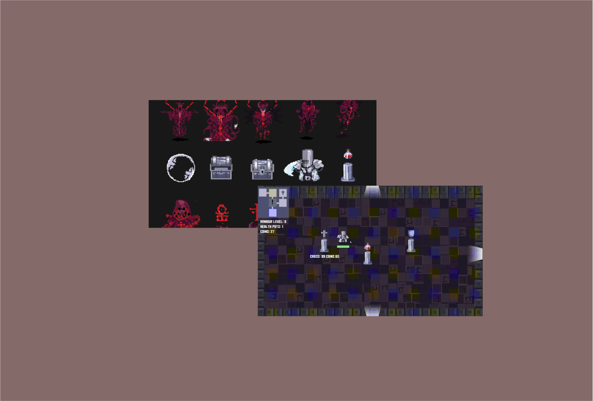
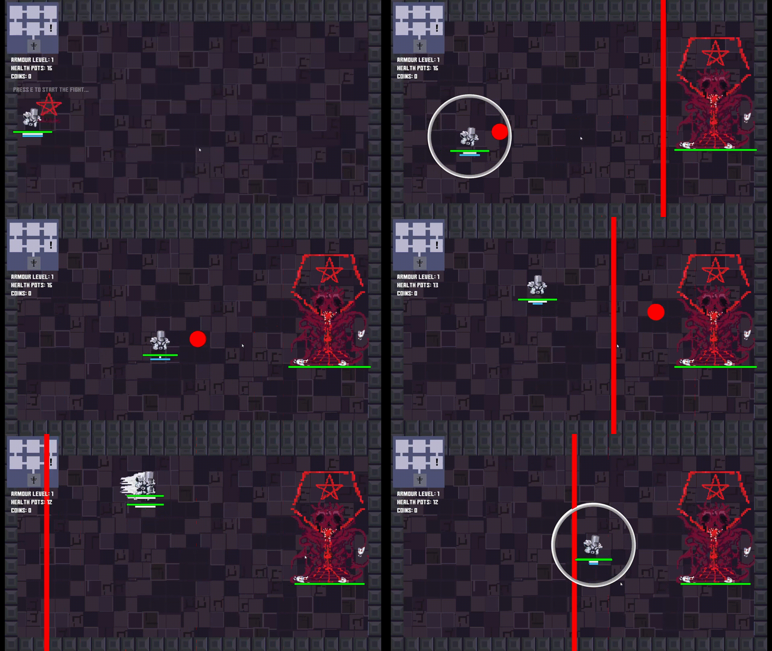
Inspired by dungeon crawlers and rouge-likes, PRAEY was my own take on this popular genre. Playing as an afflicted fallen angel, you’ll navigate 3 levels of dungeons, fighting bosses, discover secret rooms, and hack and slash your way through this bullet hell.
01.
DRAWING INSPERATION
PRAEY’s art style and gameplay was heavily inspired by the roguelike mobile game Soul Knight. Assets were drawn in pixel art to align the art direction with older styles used in older more traditional rouge likes. (This faster form of drawing also helped me make the most of the short 1 week time frame allocated to asset creation).
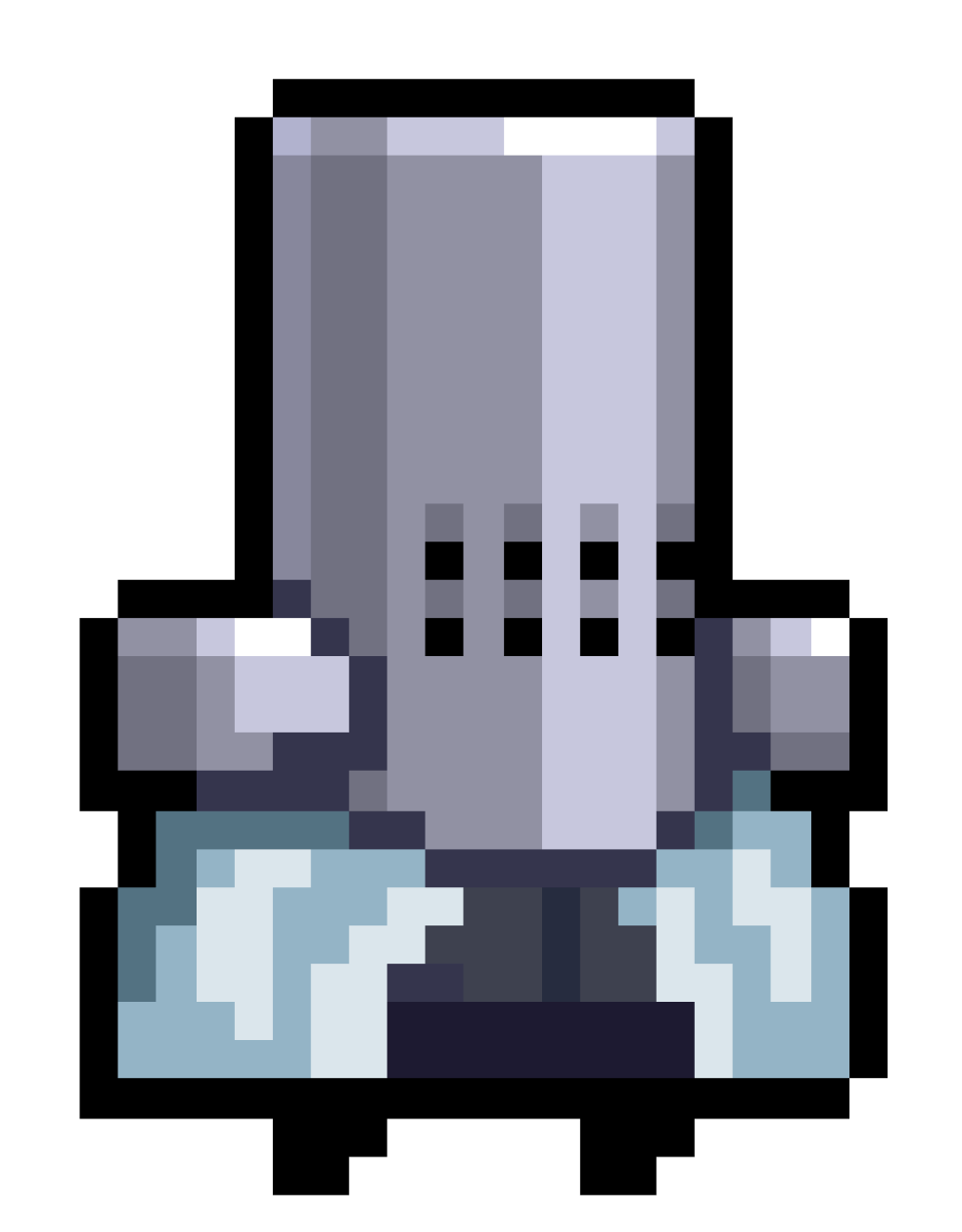
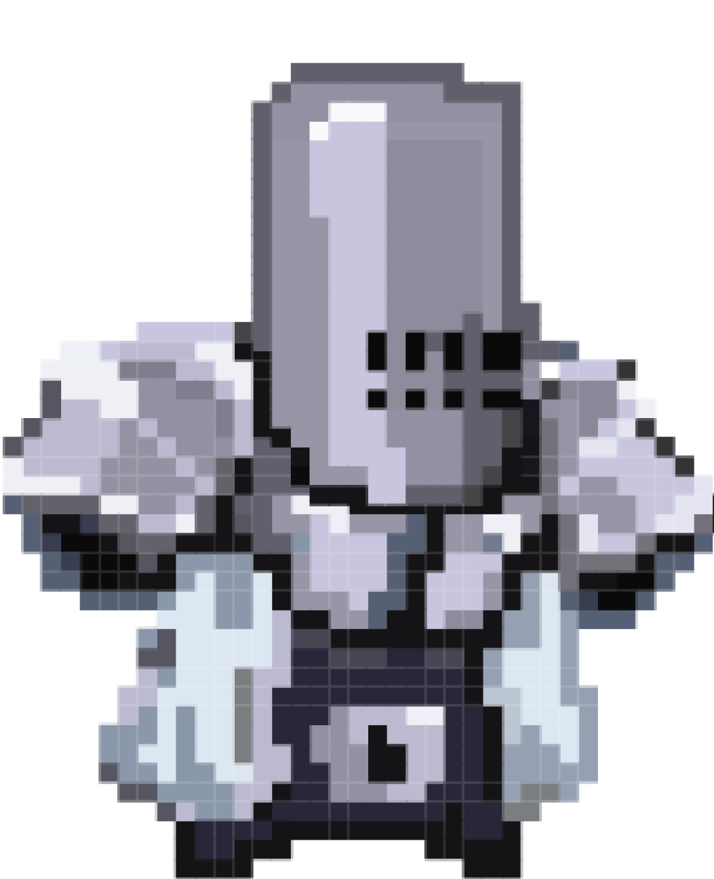
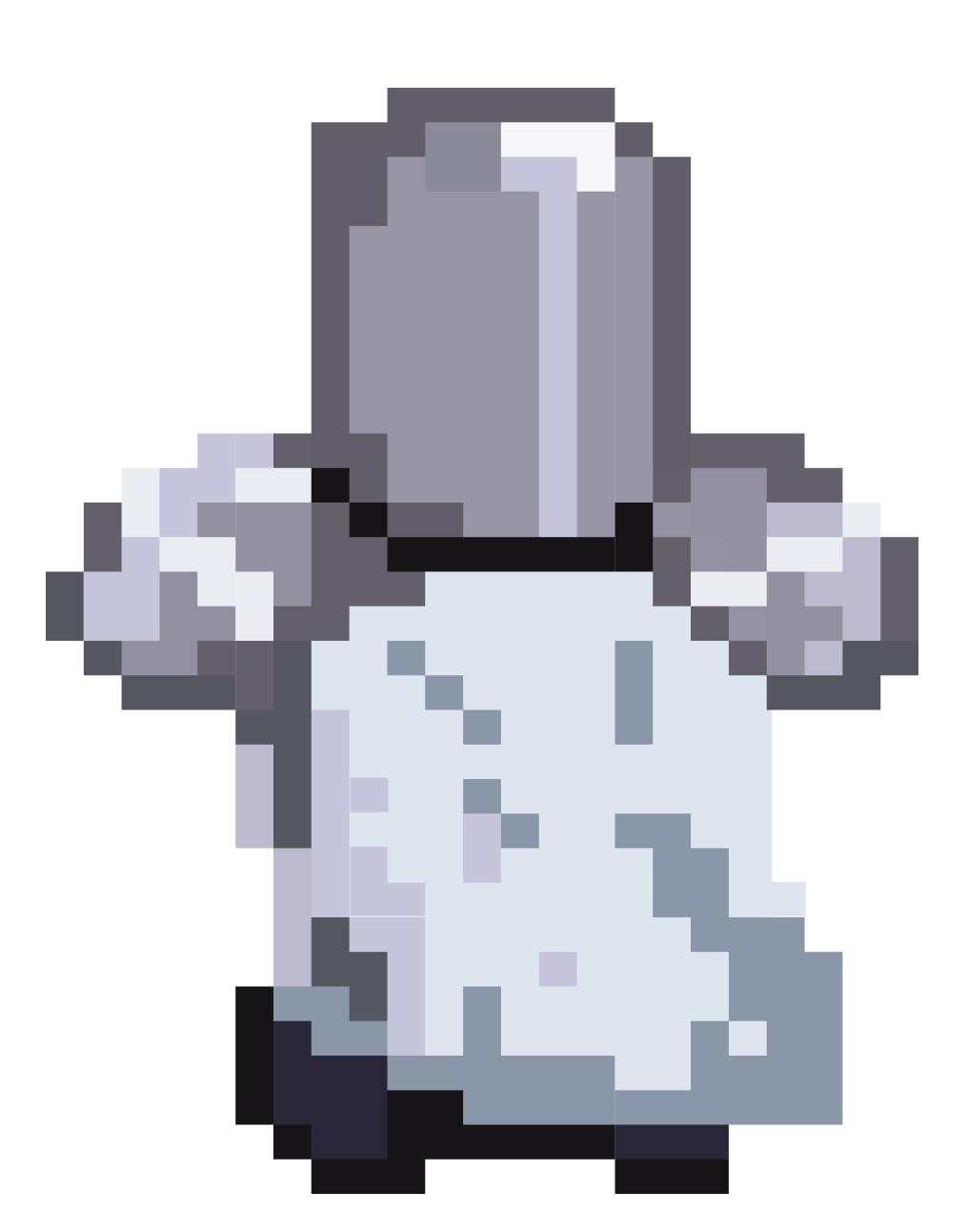
The Soul Knight Healer
My Adapted Templar
The Less Detailed Backside
LEARNING PIXEL ART
Pixel art sounded like an amazing art style to move forwards with... The only issue was that I had never drawn pixel art ever.Determined to at least give it a shot, I started like any artist would -- finding precedents. First found images that I could place a grid over, then trace. This gave me the confidence and understanding on how to start creating my own creations in pixel art. I used references for certain proportions and inspiration for characters and elements. Creating a custom color pallete and sticking to it helped with consistency. Alot of what I did was improvised, and inspired by precedents that I would find online.
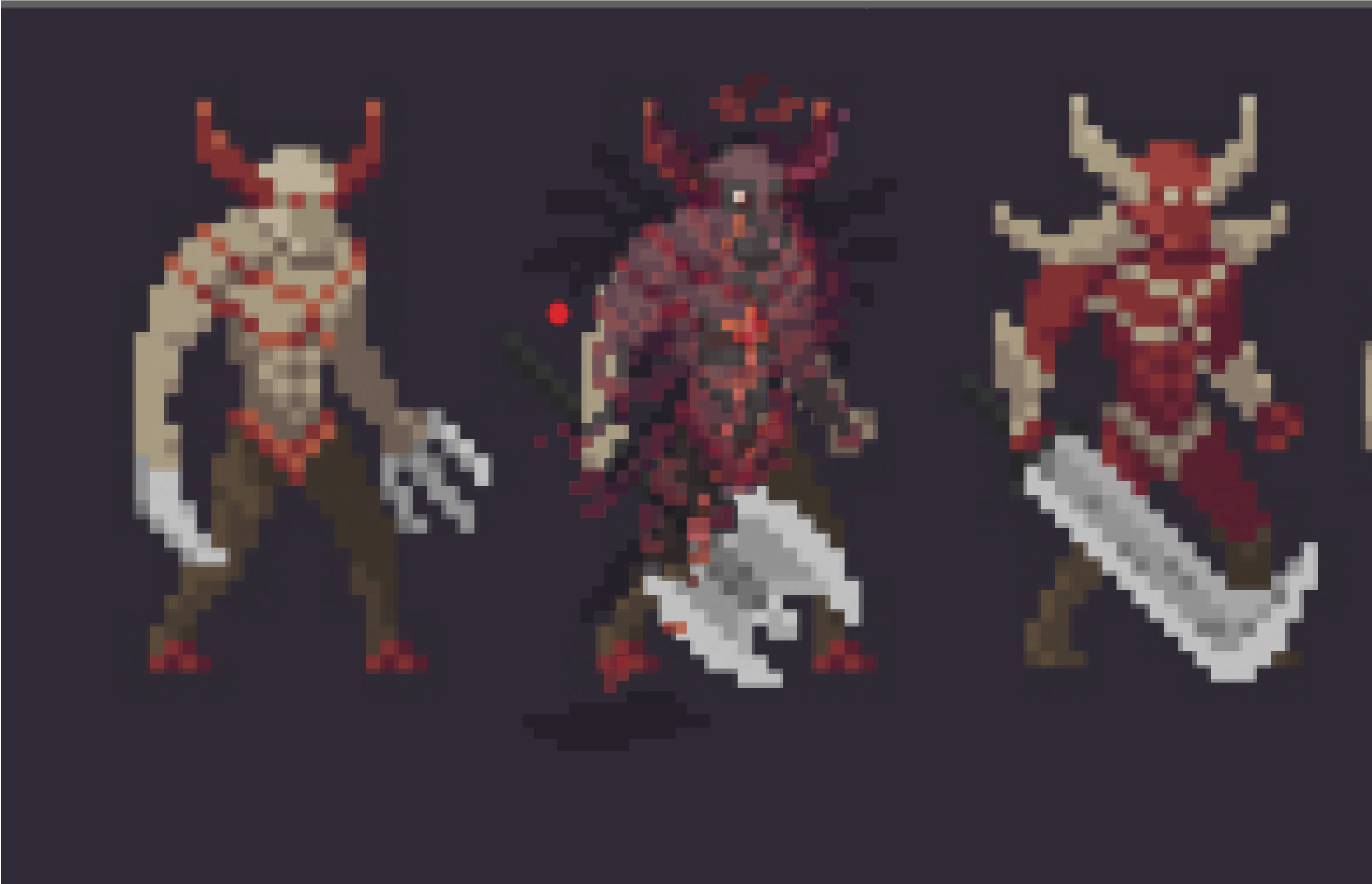
Picking out Precedents
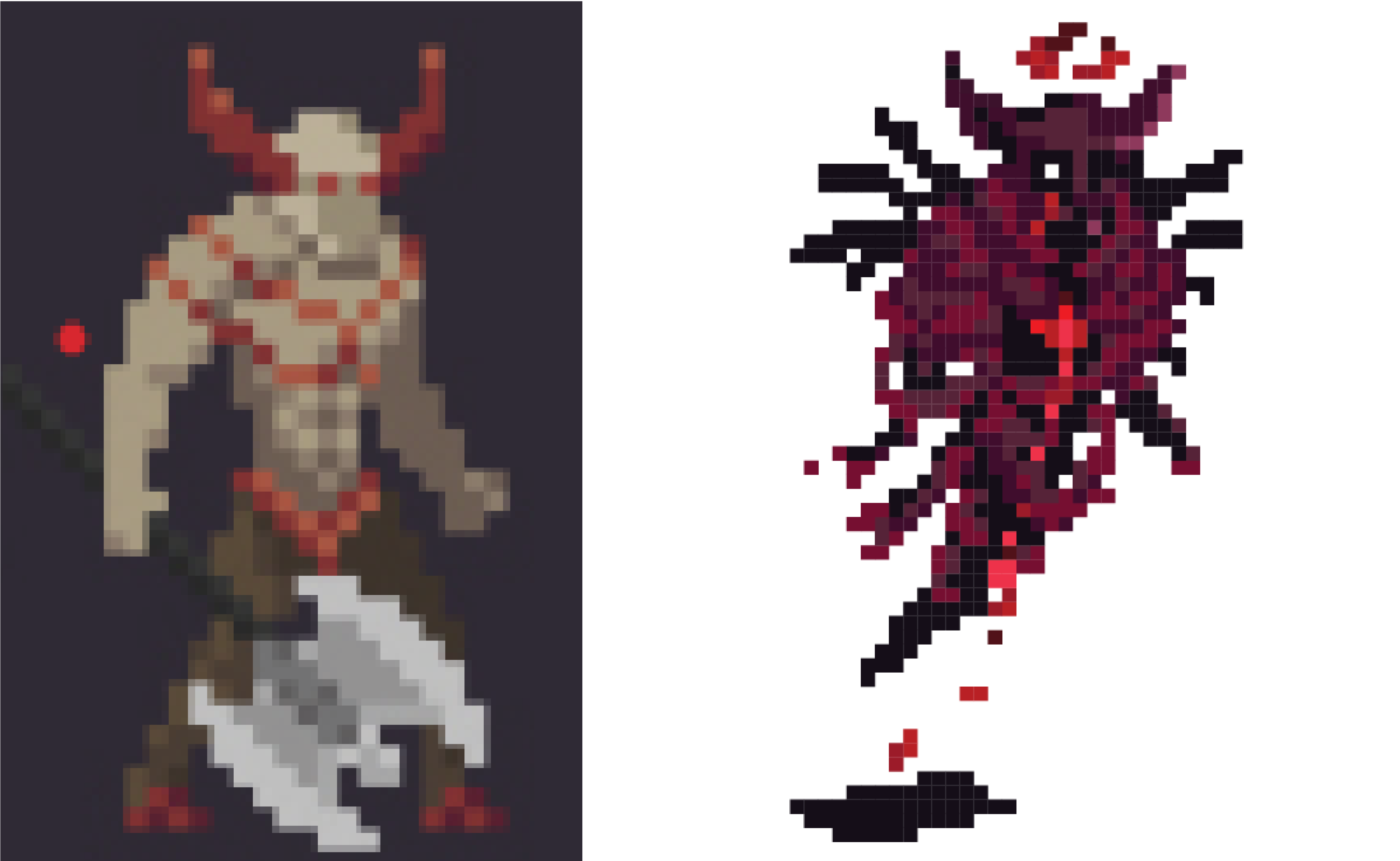
I didn’t randomly select pieces' of art that I thought was cool, I looked for designs that I liked and could be adapted to my style of design. The deal breaker for me was usually finding an element (such as the head, or chest) that I liked.
Oh hey, they have the same head!
I didn’t randomly select pieces' of art that I thought was cool, I looked for designs that I liked and could be adapted to my style of design. The deal breaker for me was usually finding an element (such as the head, or chest) that I liked.
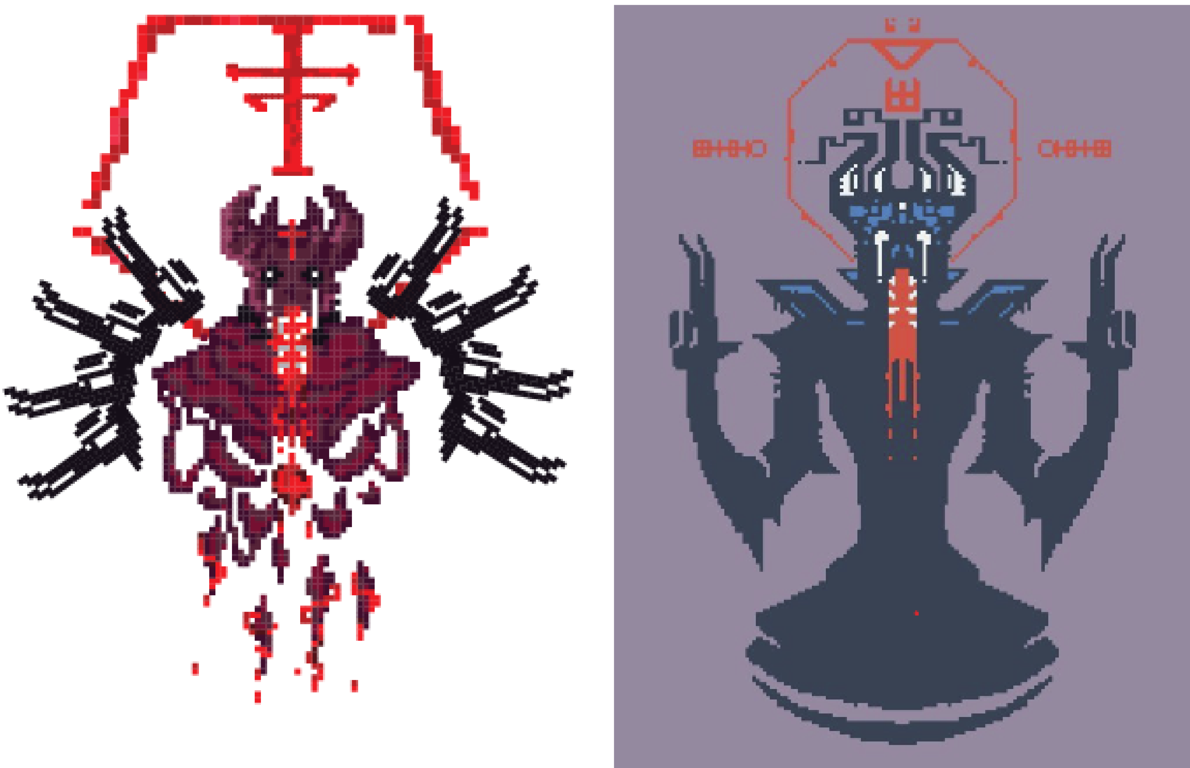
So... where’d the hands go?
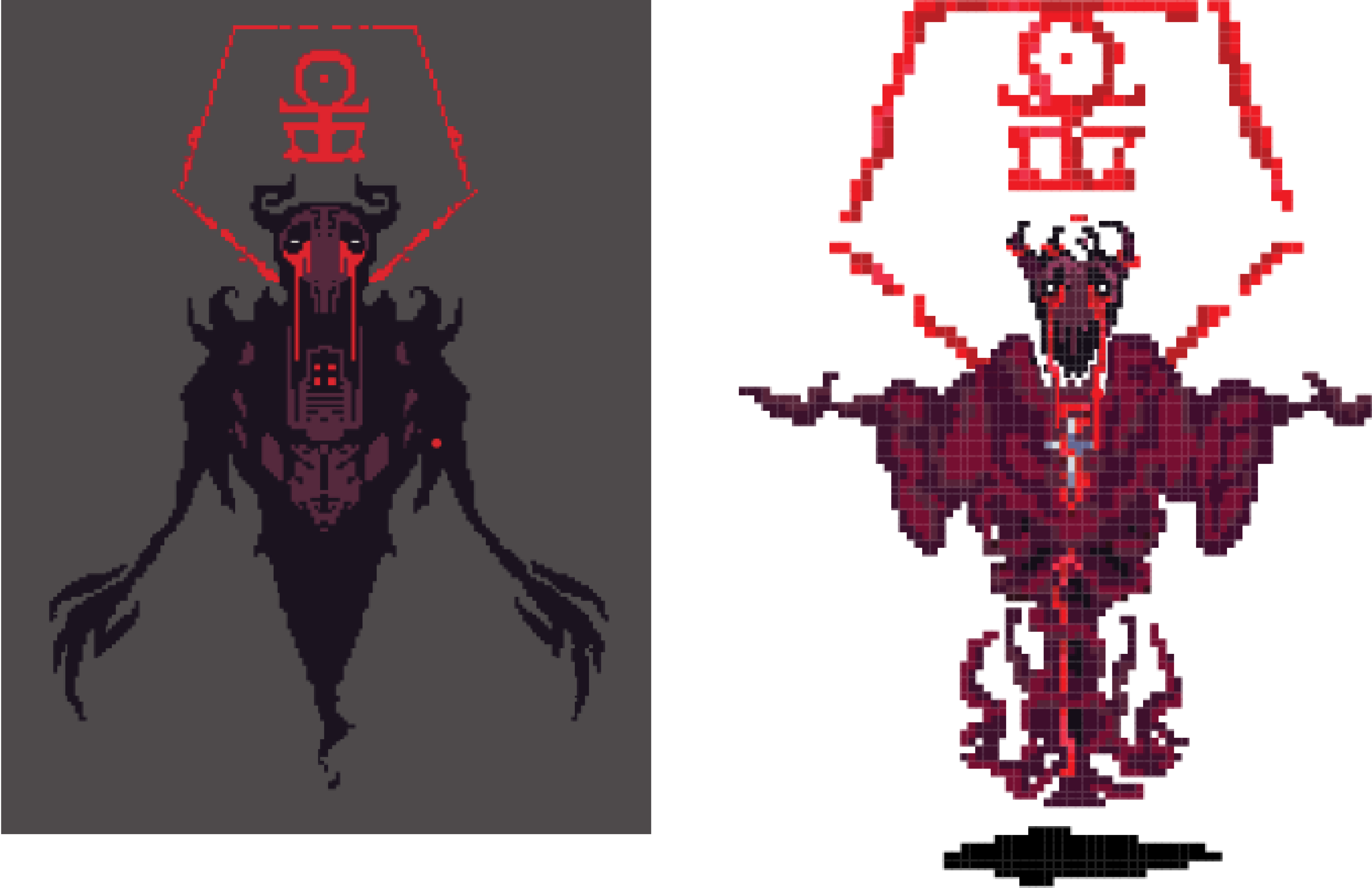
Other times I would draw inspiration from art I find online, but heavily modify it in order to fit the theme of my enemies. Removing and dehumanizing my bosses kept the designs gory and captivating.
02.
ASSET SHOWCASE
Annnnnd thats a wrap. After one week, I exhausted. I managed to create ~18 unique assets which I couldn’t wait to bring to life. I drew alot of inspiration from games I used to play such as Stardew Valley, Terraria, and Soul knight.
THE ENEMIES
Inspired by Carrion , the enemies in this game were designed to be gory, unsettling, and pure evil. A Distinctive crimson blood red color scheme helped them, while simultaneously setting them apart from the player. Elements such as blood, tentacles, random hanging segments and glowing cores became consistent elements in their designs.
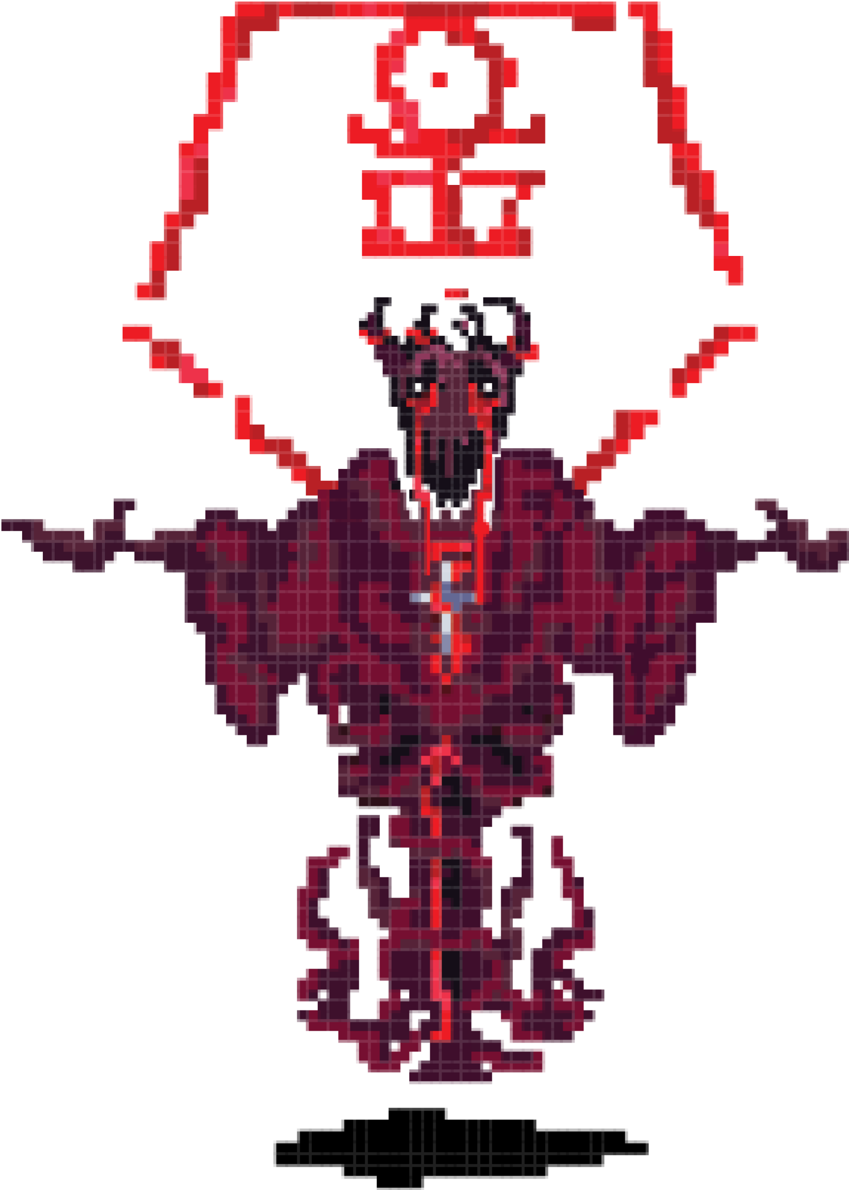
Anacrux
Floor 2 Boss
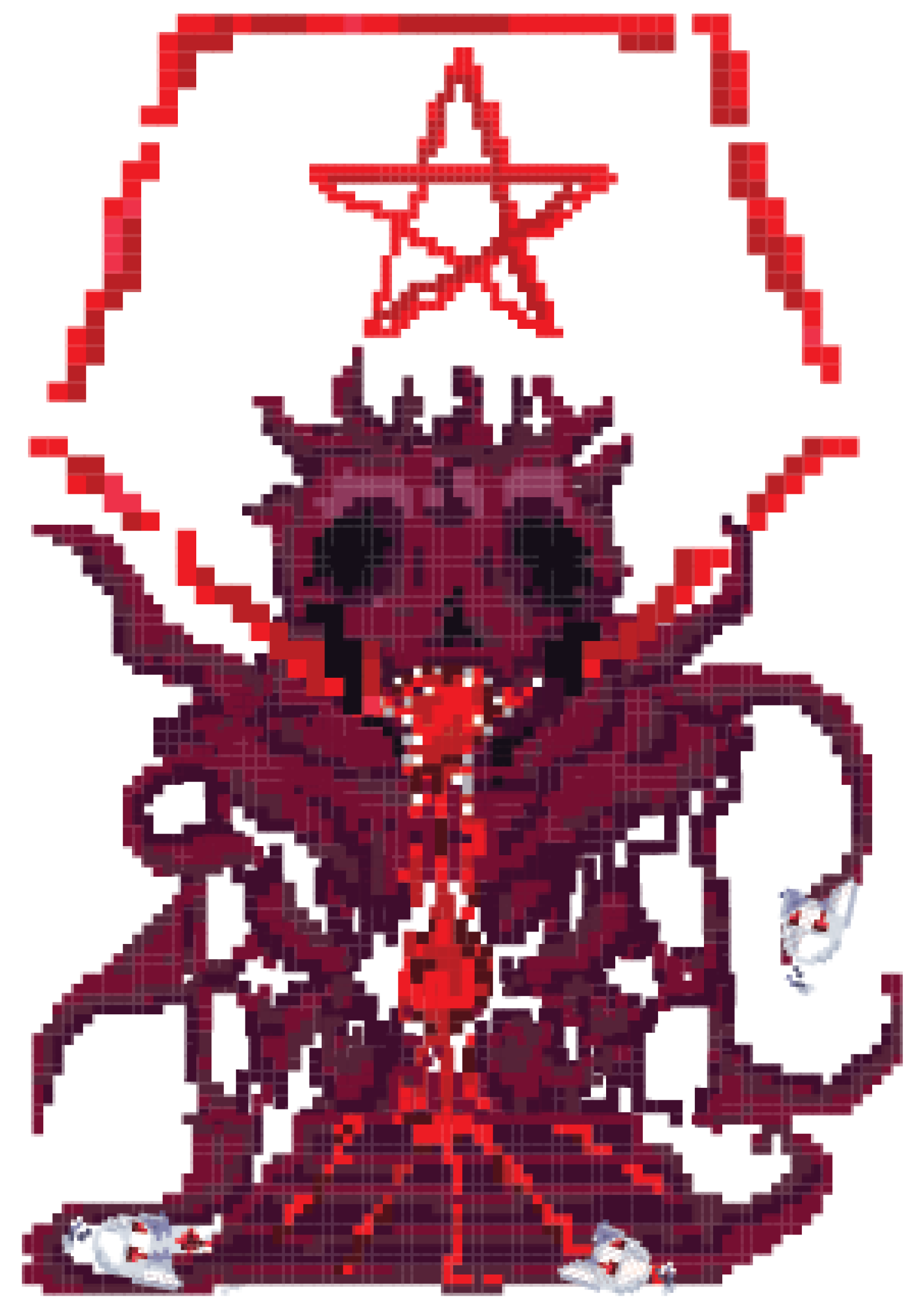
Gatekeeper
Floor 3 Boss
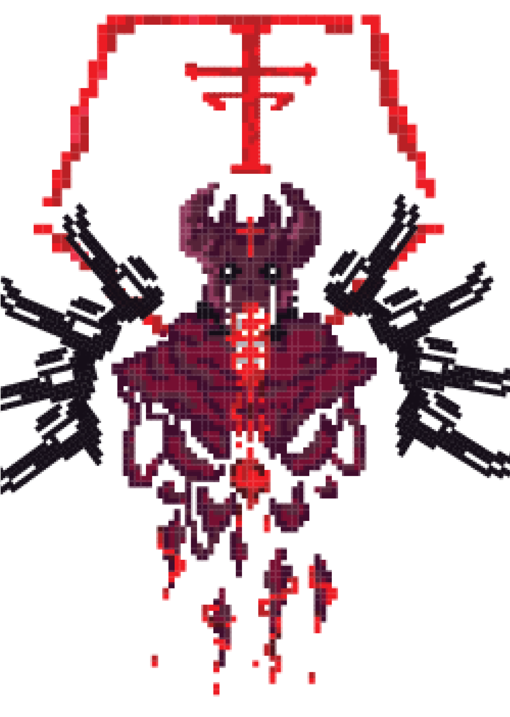
F'Pheral
Floor 1 Boss
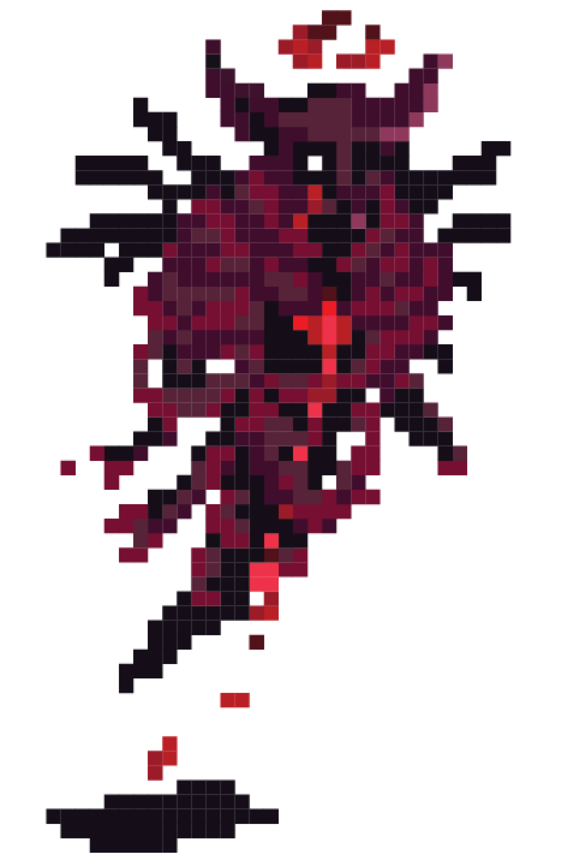
Husk
Floor 1 Enemy
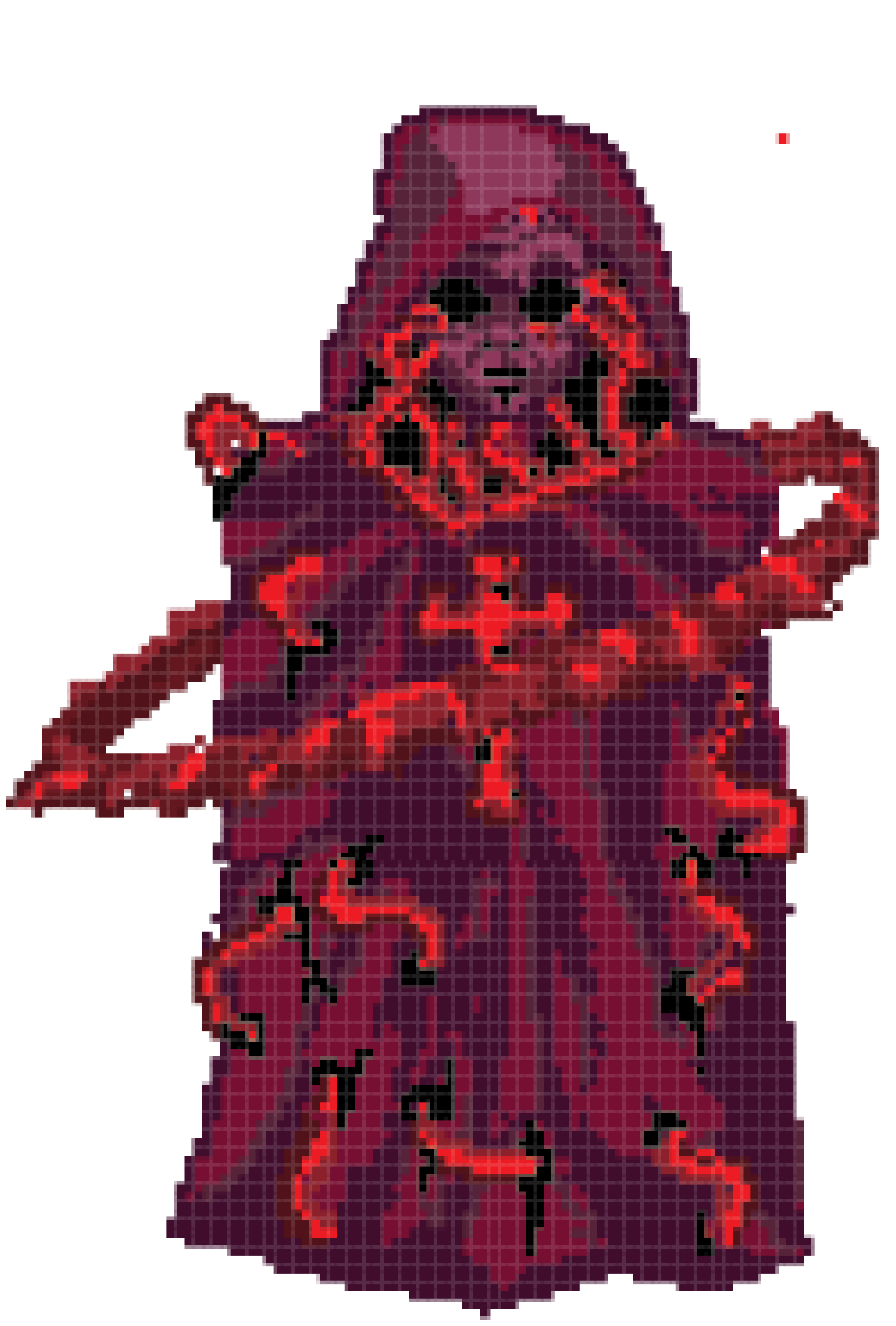
Monument
Floor 3 Enemy
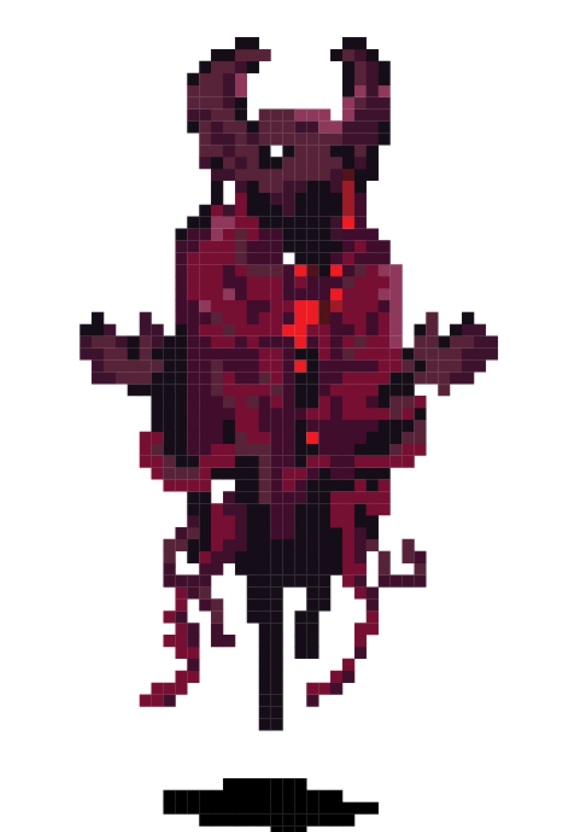
Llyes
Floor 2 Enemy
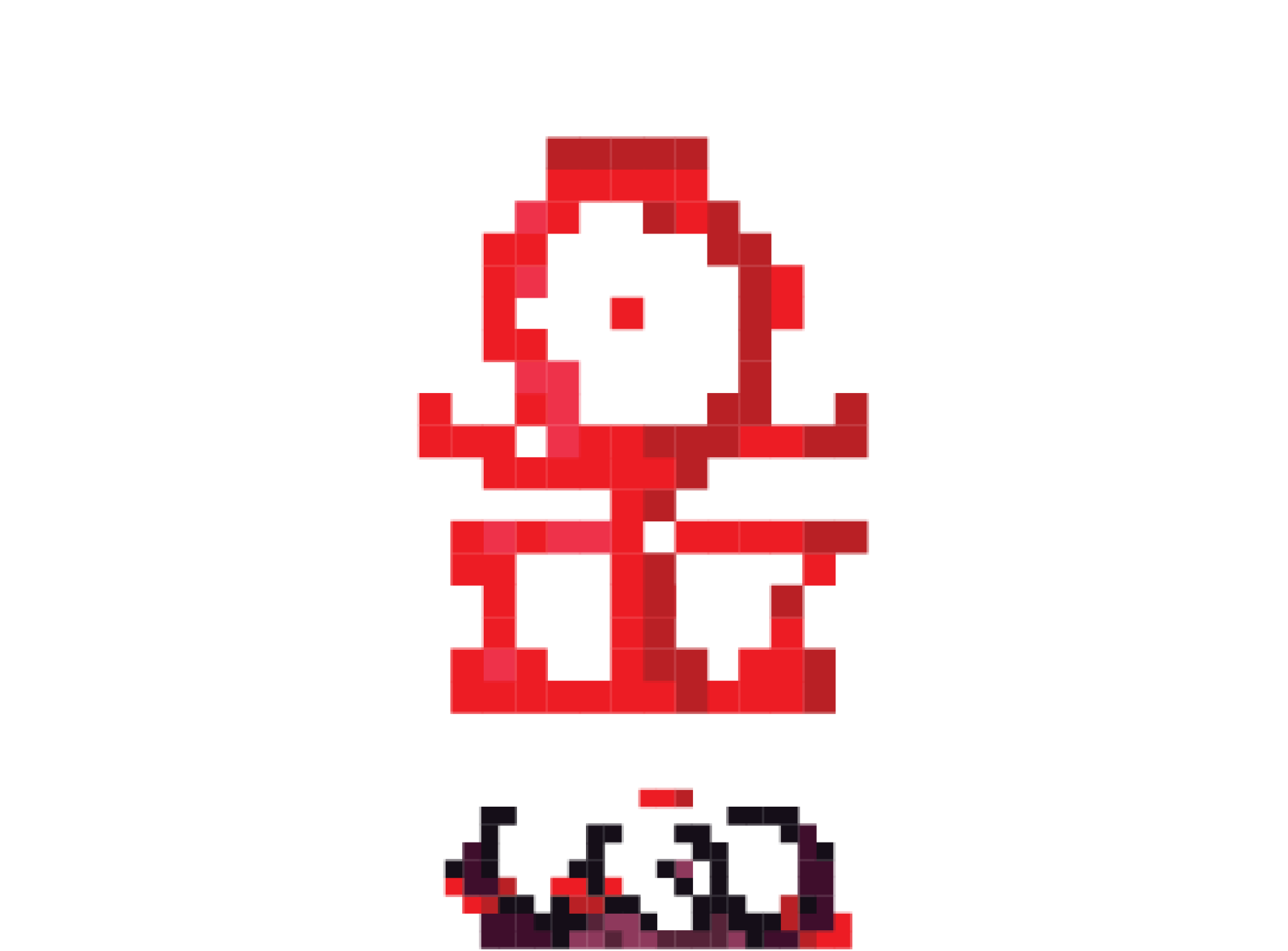
Anacrux's Spawner
Enemy
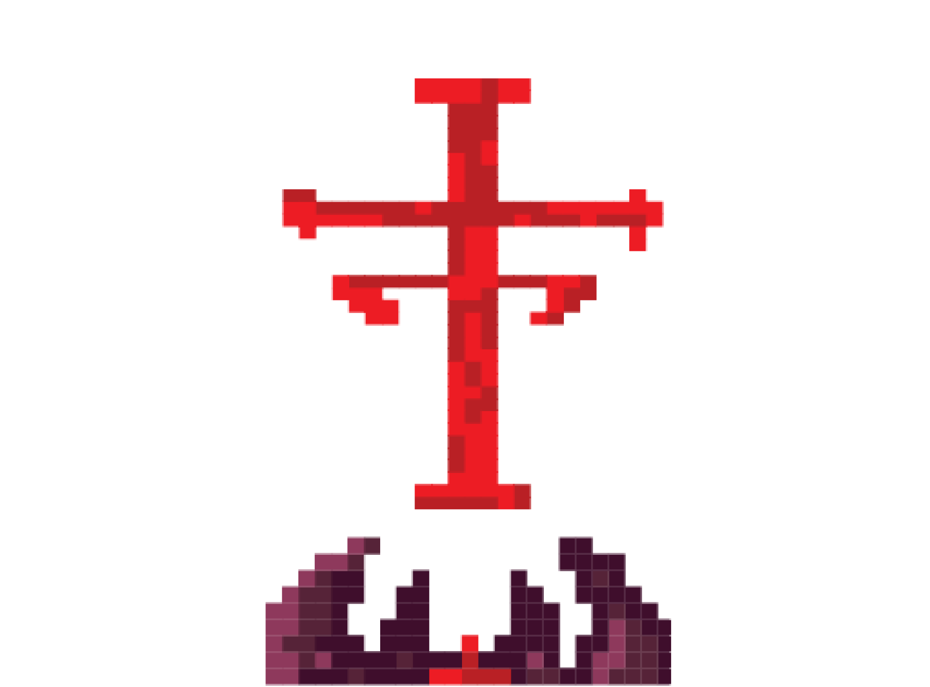
Gatekeeper's Spawner
Enemy
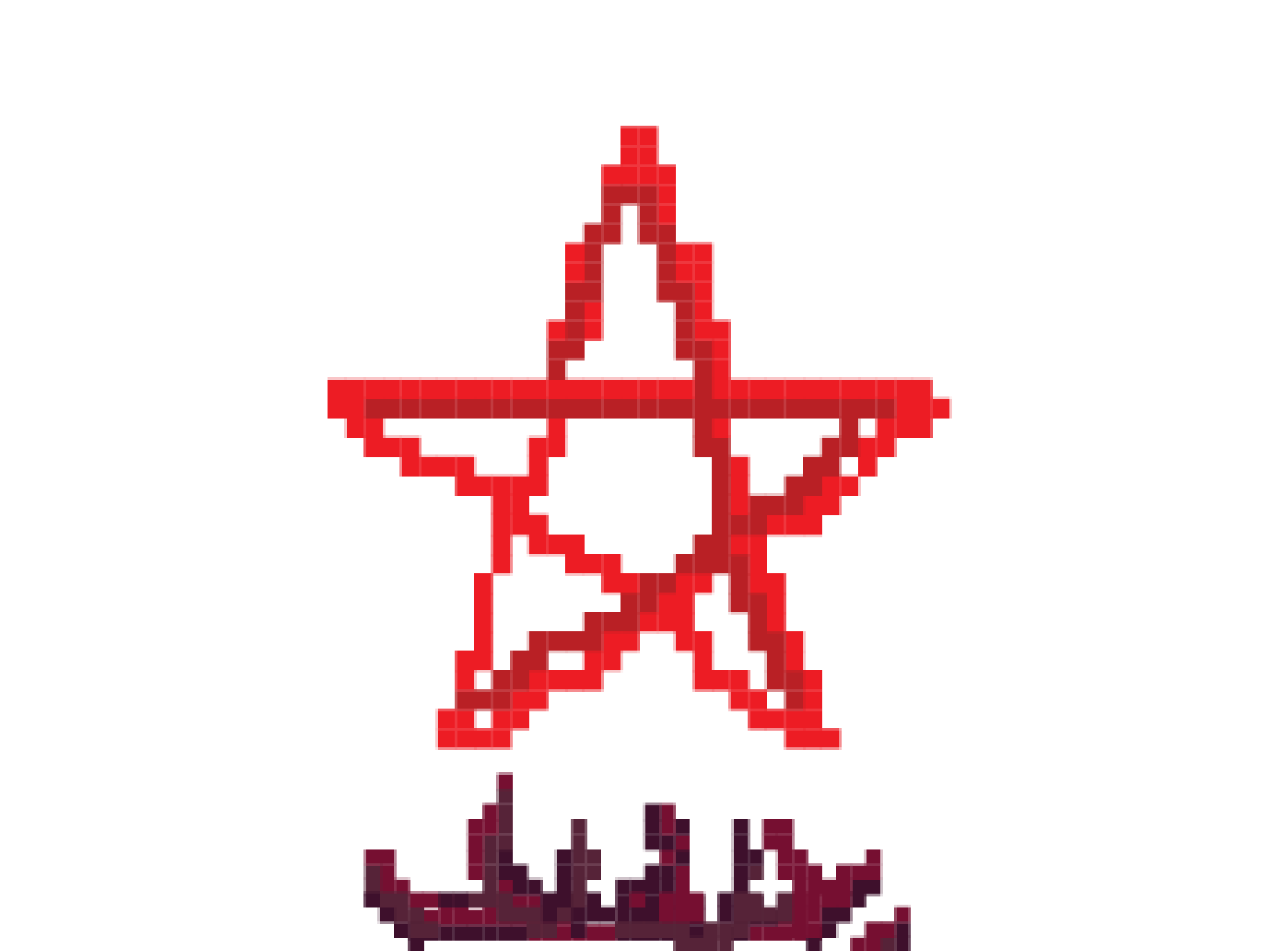
F'Pheral's Spawner
Enemy
THE PLAYER & SUPPORT ITEMS
Supportive items and the player all shared the same color scheme to represent neutrality and purity. The use of a medium stone grey and purple canvas was a stark contrast against the onslaught of red.
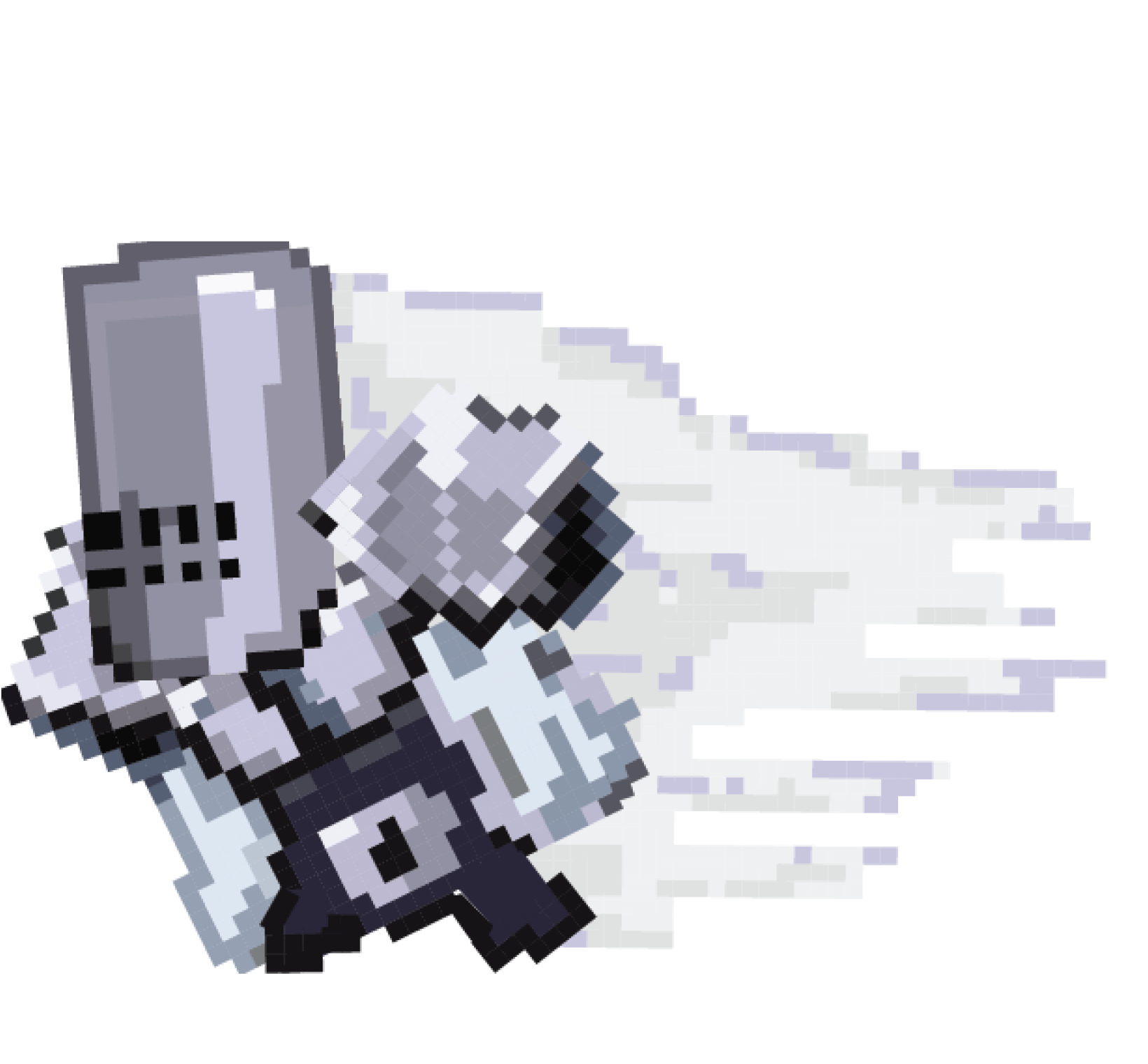
Templar
Dash Sprite
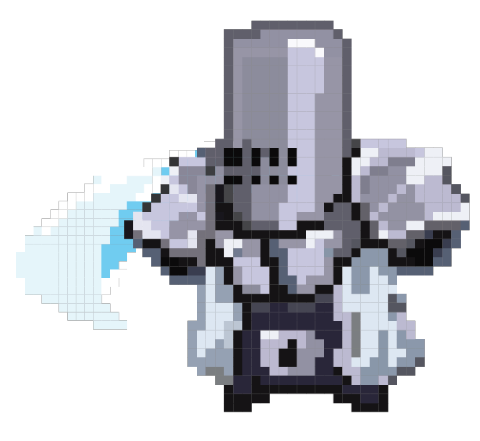
Templar
Attack Sprite
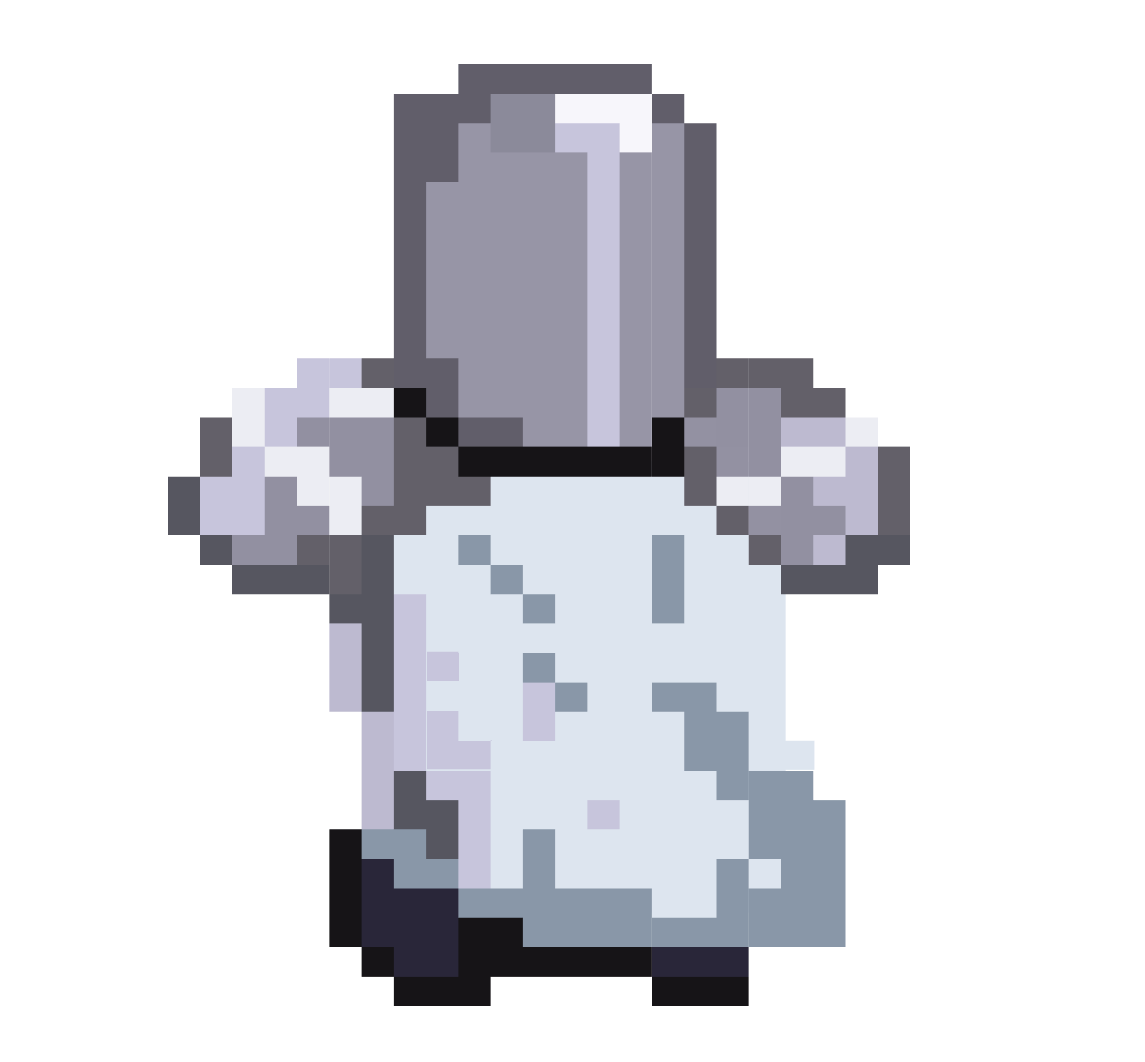
Templar
Back Sprite

Shield
Interactive Item
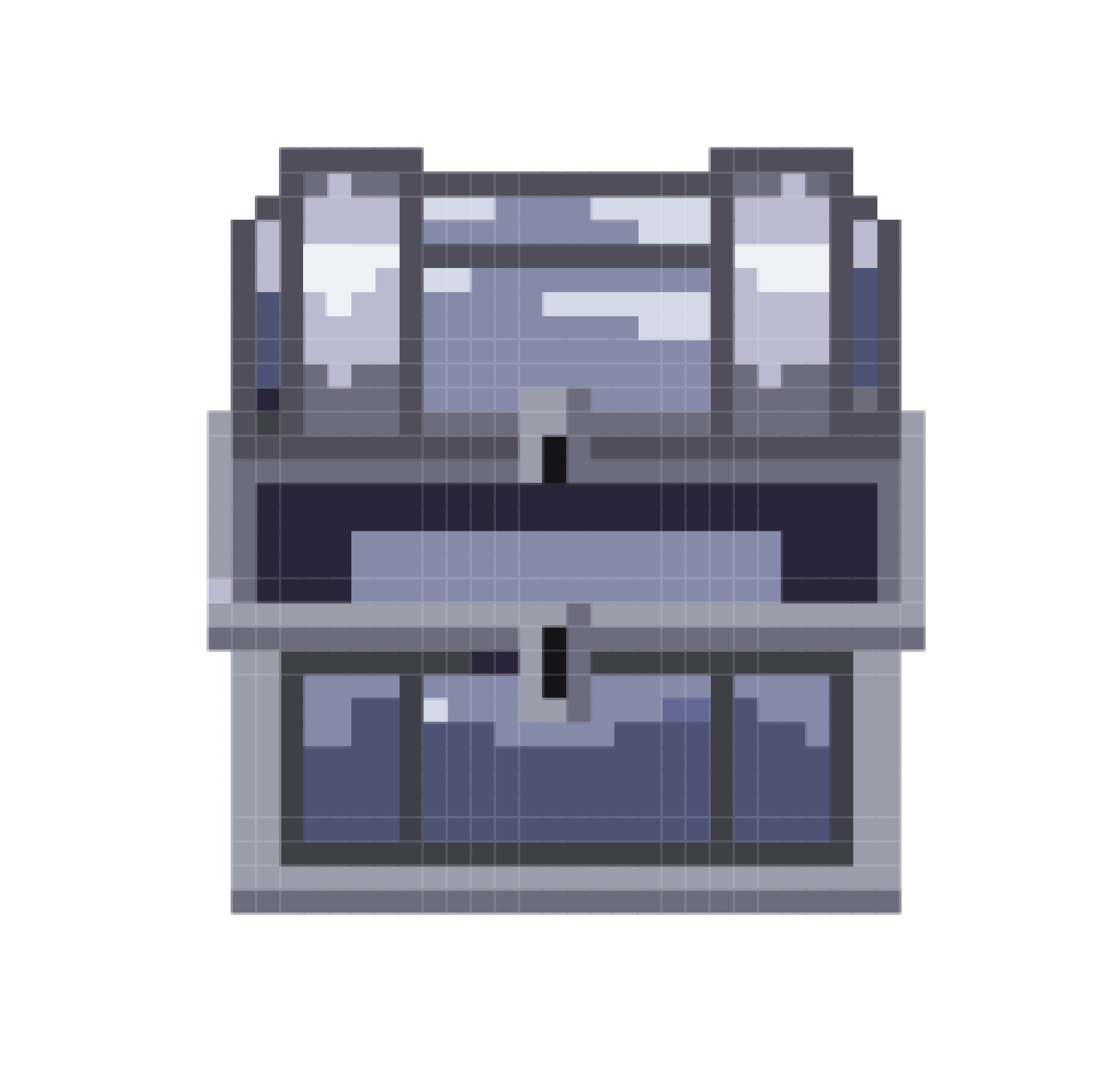
Open Chest
Interactive Item
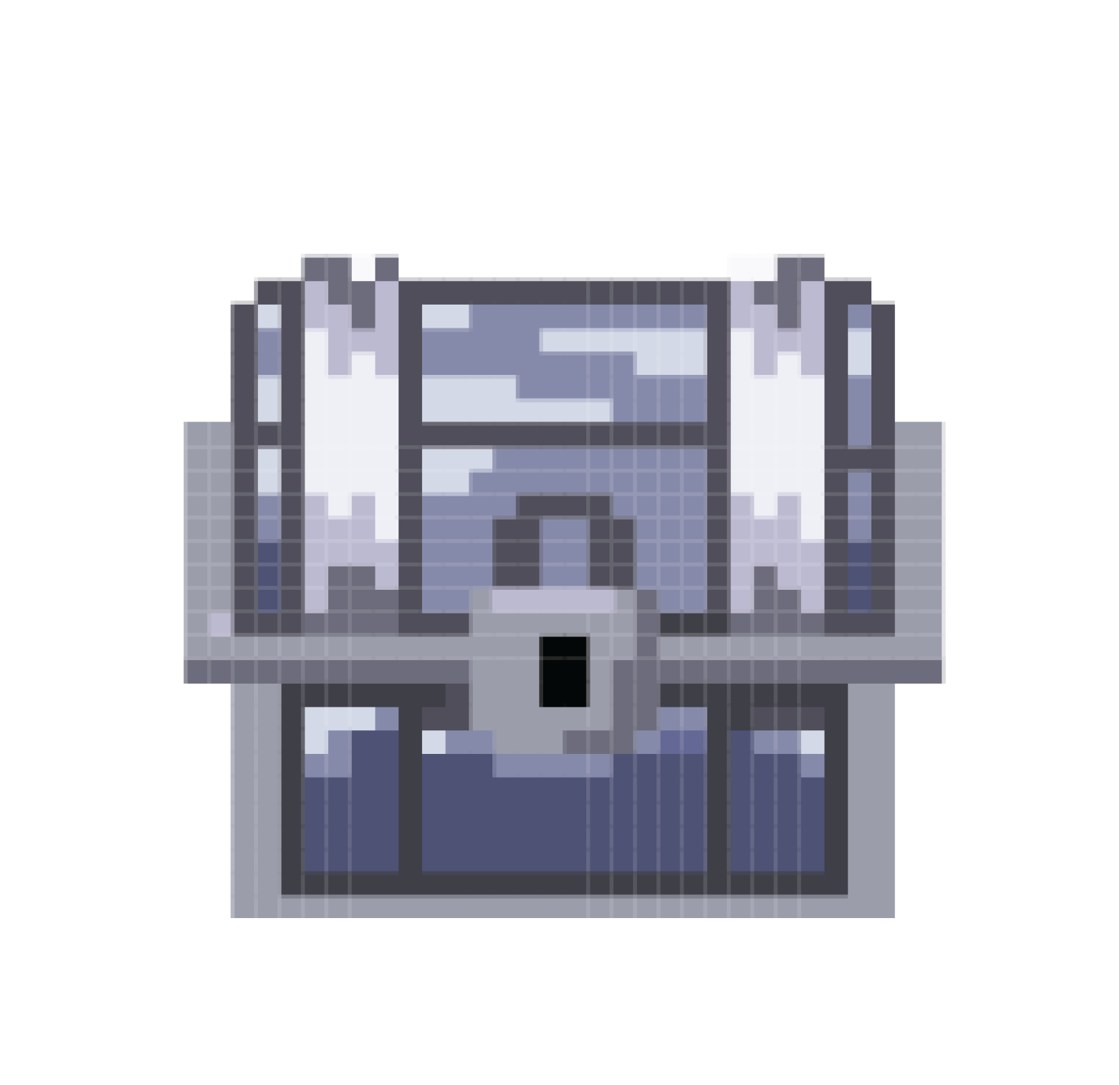
Closed Chest
Interactive Item
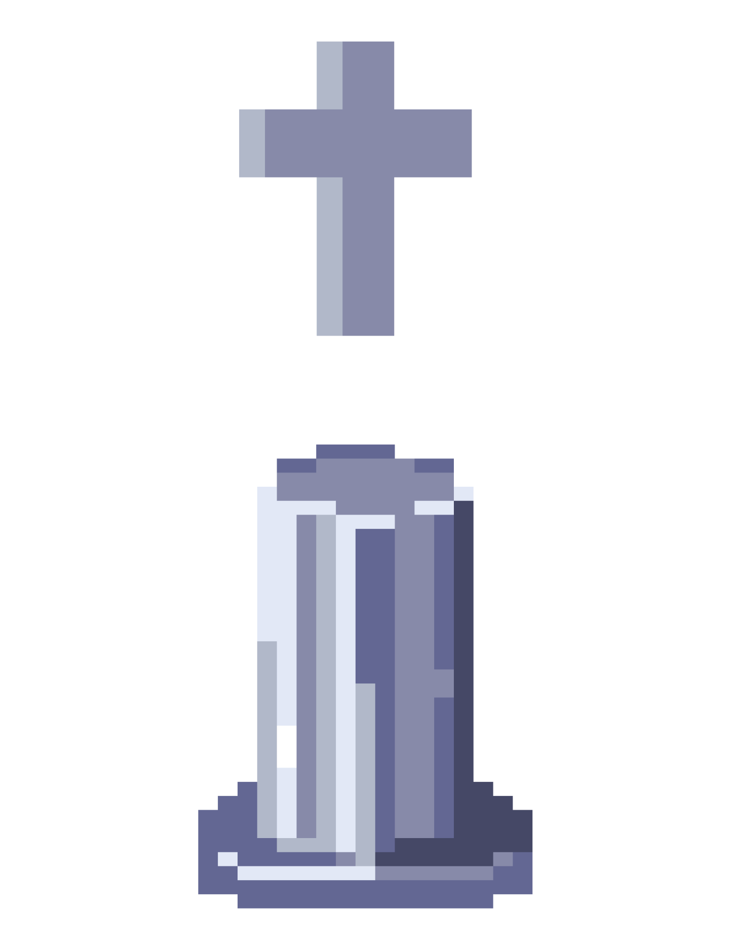
Holy Cross
Interactive Item

Armour Dispenser
Interactive Item
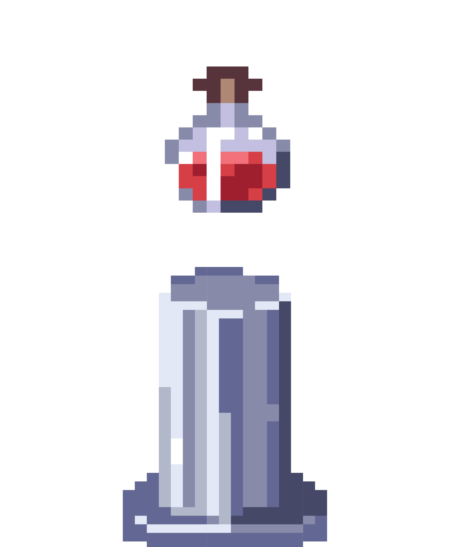
Potion Dispenser
Interactive Item
Inspired by Carrion , the enemies in this game were designed to be gory, unsettling, and pure evil. A Distinctive crimson blood red color scheme helped them, while simultaneously setting them apart from the player. Elements such as blood, tentacles, random hanging segments and glowing cores became consistent elements in their designs.

Anacrux
Floor 2 Boss

Gatekeeper
Floor 3 Boss

F'Pheral
Floor 1 Boss

Husk
Floor 1 Enemy

Monument
Floor 3 Enemy

Llyes
Floor 2 Enemy

Anacrux's Spawner
Enemy

Gatekeeper's Spawner
Enemy

F'Pheral's Spawner
Enemy
THE PLAYER & SUPPORT ITEMS
Supportive items and the player all shared the same color scheme to represent neutrality and purity. The use of a medium stone grey and purple canvas was a stark contrast against the onslaught of red.

Templar
Dash Sprite

Templar
Attack Sprite

Templar
Back Sprite

Shield
Interactive Item

Open Chest
Interactive Item

Closed Chest
Interactive Item

Holy Cross
Interactive Item

Armour Dispenser
Interactive Item

Potion Dispenser
Interactive Item

Anacrux
Floor 2 Boss

Gatekeeper
Floor 3 Boss

F'Pheral
Floor 1 Boss

Husk
Floor 1 Enemy

Monument
Floor 3 Enemy

Llyes
Floor 2 Enemy

Anacrux's Spawner
Enemy

Gatekeeper's Spawner
Enemy

F'Pheral's Spawner
Enemy
Supportive items and the player all shared the same color scheme to represent neutrality and purity. The use of a medium stone grey and purple canvas was a stark contrast against the onslaught of red.

Templar
Dash Sprite

Templar
Attack Sprite

Templar
Back Sprite

Shield
Interactive Item

Open Chest
Interactive Item

Closed Chest
Interactive Item

Holy Cross
Interactive Item

Armour Dispenser
Interactive Item

Potion Dispenser
Interactive Item

Templar
Dash Sprite

Templar
Attack Sprite

Templar
Back Sprite

Shield
Interactive Item

Open Chest
Interactive Item

Closed Chest
Interactive Item

Holy Cross
Interactive Item

Armour Dispenser
Interactive Item

Potion Dispenser
Interactive Item
03.
CODING THE GAME
PRAEY’s art style and gameplay was heavily inspired by the roguelike mobile game Soul Knight. Assets were drawn in pixel art to align the art direction with older styles used in older more traditional rouge likes. (This faster form of drawing also helped me make the most of the short 1 week time frame allocated to asset creation).
Mapping Interactions
During early stages of development, nteractions between classes were mapped and planned using an UML diagram. Narrative was determined by Marc Leblanc’s 8 types of Funs -- Narrative/Discovery.
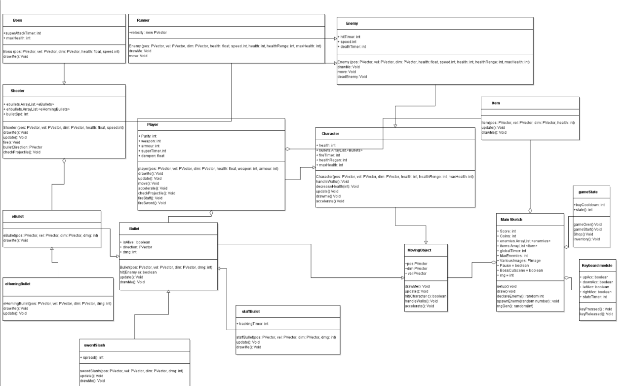
Definitely too ambitious on my end looking back on it.
Programming the game
Return later.
04.
GAMEPLAY HIGHLIGHTS
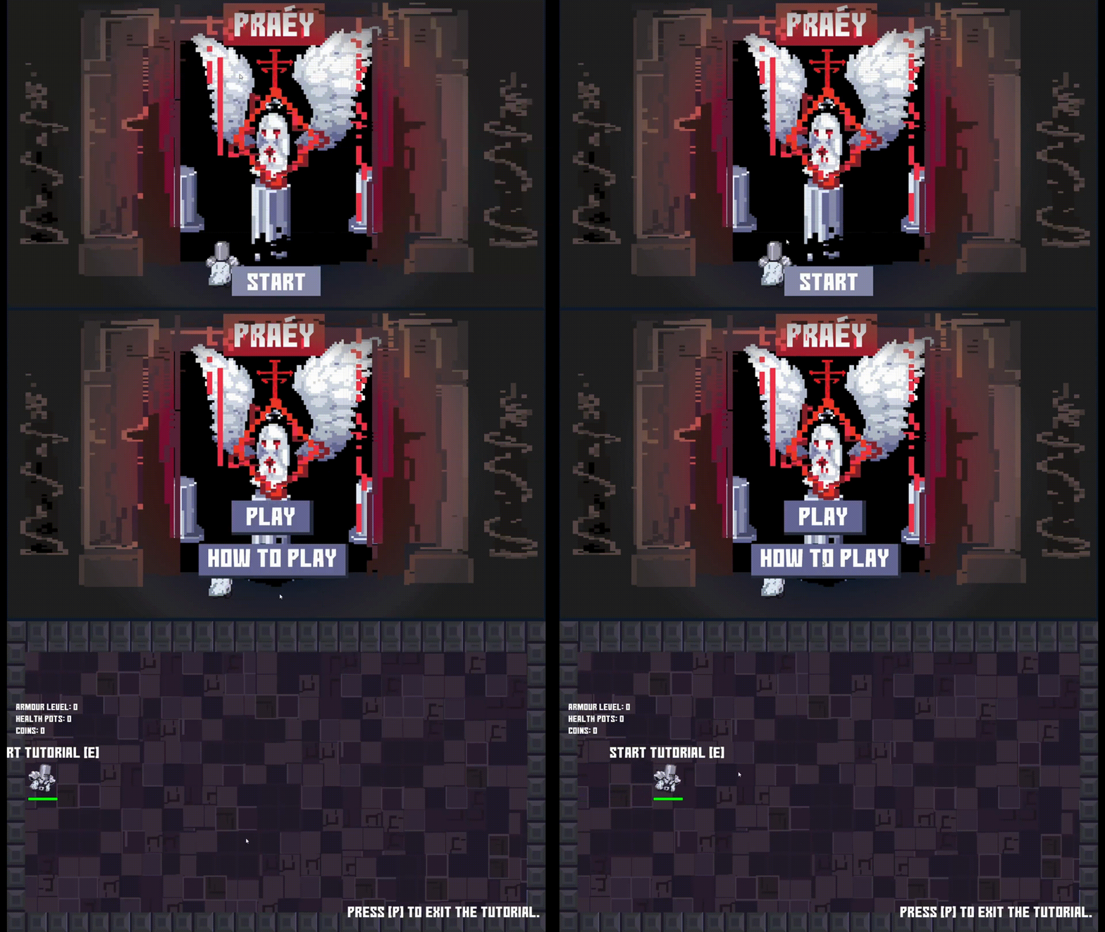
Below are clips of both the game assest, and the code used to bring them to life, in action.
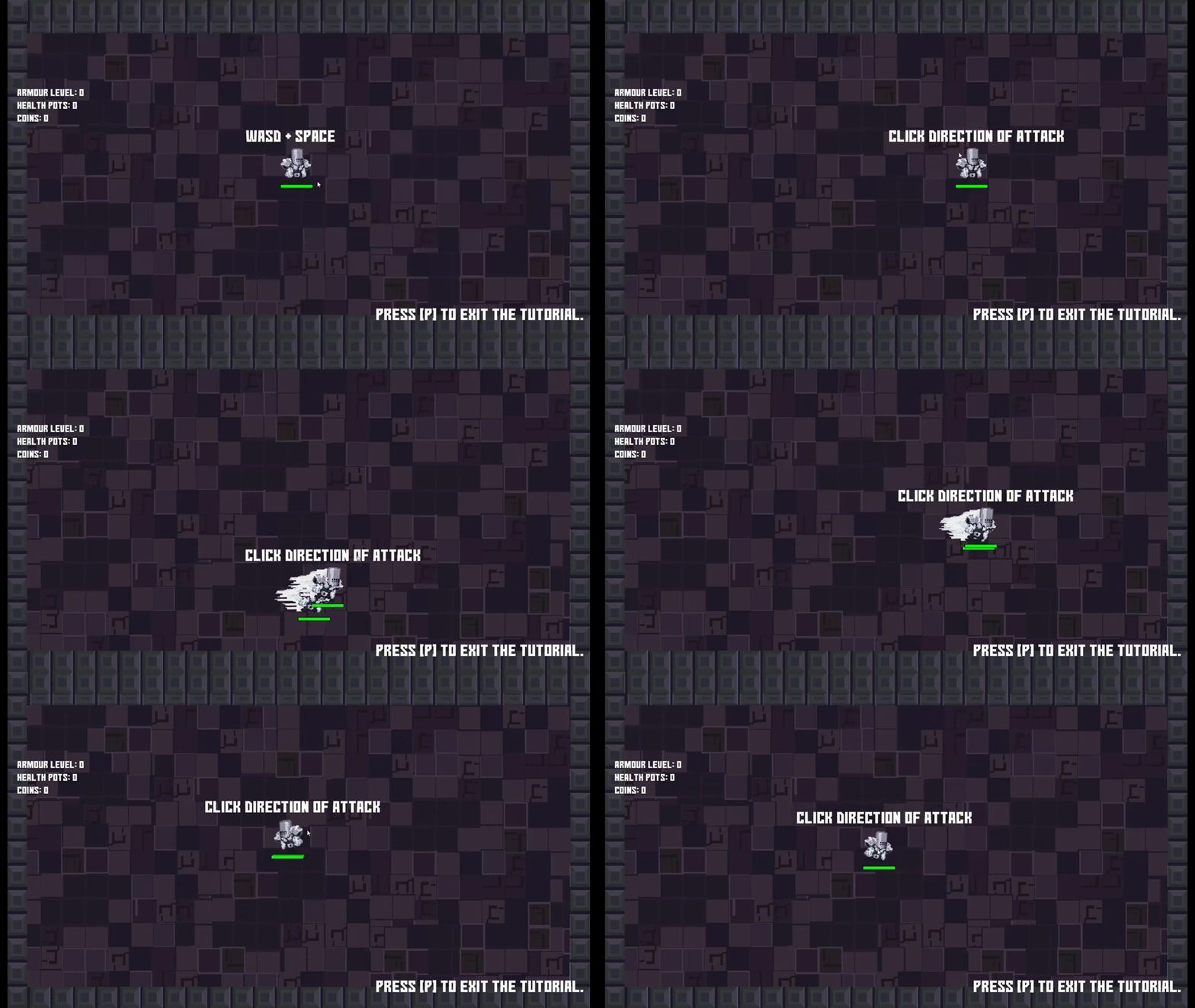
The Tutorial
The tutorial teaches the player the basic controls including how to move, attack, and dash. This equips players with an understanding on how to play the game to enhance playability.
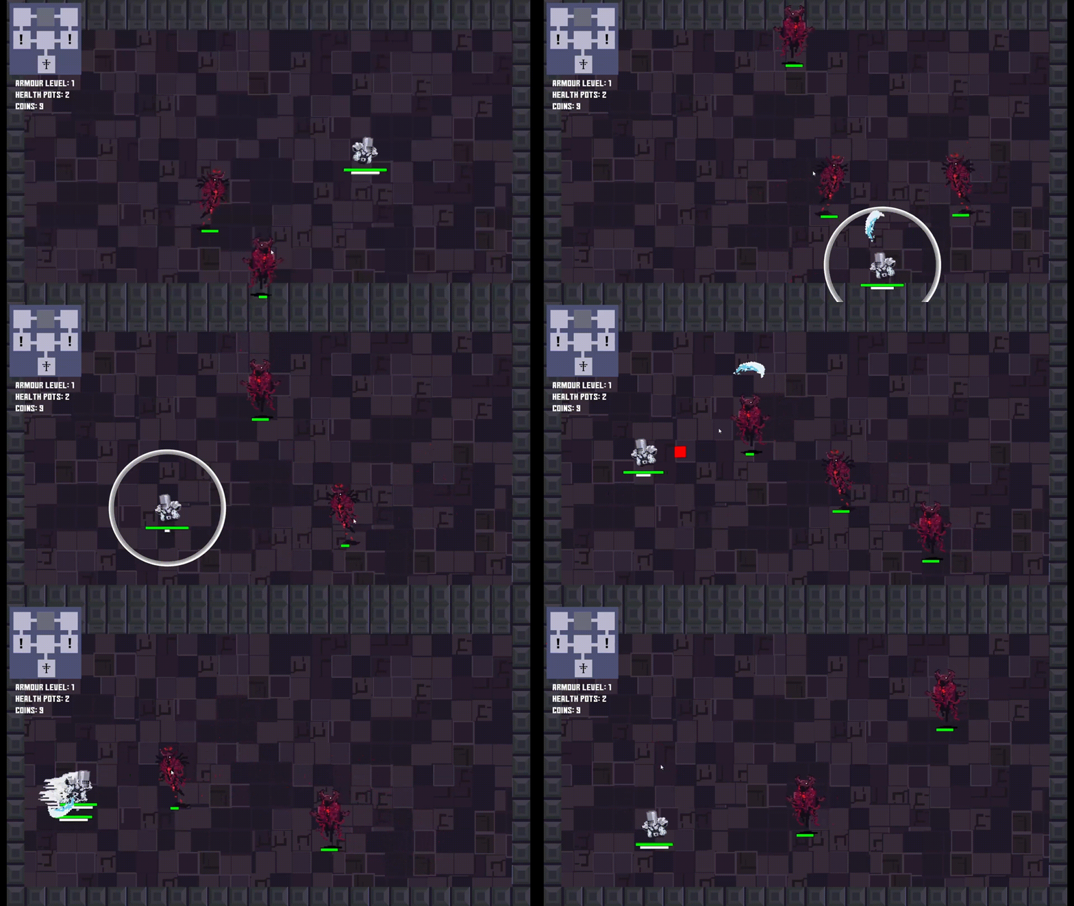
Enemy Interactions
Due to how complicated and heavy the sprites were in game, bullets were simple vectors as the game suffered from substantial lag. Enemies get progressively stronger as the player progresses.
Item, Room & Chests
Interactive elements were scattered throughout the game to encourage exploration. Upon clearing a room of enemies, a chest will appear rewarding the player.
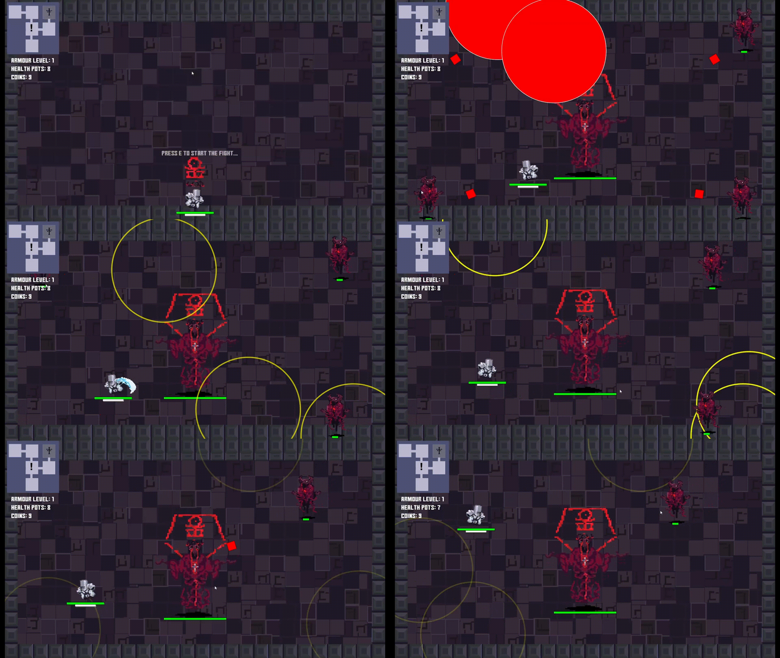
Boss Fights
Bosses feature multiple unique attacks that make them more difficult to fight compared to regular enemies. The fights were designed to necessitate progression, as buffs from previous floors were needed to survive boss attacks.
